from scipy.io import wavfile
from pathlib import PathFirst I created the simple sound file in Reaper. I could not use the base WAV (Waveform Audio File Format) file because it stores it as 24-bit data which does not work with the scipy wavfile method. However, choosing 32-bit data is a simple option when you render the sound.
The sound I created was simple 2 seconds of a sine wave at around C4. Zooming in to a 0.045 second window we can see the wave in Reaper. A simple peak-to-peak measure was 0.00375 seconds long which gives a frequency around 267 herz. Since this was a C4, which is typically 262 it is not too far off.
To read the file a quick search brought up the wavfile method from scipy. I basically follow the example provided there on my sound.
p = Path('sounds')q = p / 'simple_c4.wav'qWindowsPath('sounds/simple_c4.wav')sample_rate, data = wavfile.read(q)c:\python37\lib\site-packages\scipy\io\wavfile.py:273: WavFileWarning: Chunk (non-data) not understood, skipping it.
WavFileWarning)sample_rate44100dataarray([[ 0.0000000e+00, 0.0000000e+00],
[ 0.0000000e+00, 0.0000000e+00],
[-3.8028106e-06, -3.8028106e-06],
...,
[-6.6743125e-03, -6.6743125e-03],
[-4.4752425e-03, -4.4752425e-03],
[-2.2473824e-03, -2.2473824e-03]], dtype=float32)data.shape(88200, 2)Since the recording is 2 seconds long and the sample rate is 44100, there are 88200 samples total, as expected. This is a list of channel lists. So, the stereo data is recorded for each sample.
length = data.shape[0] / sample_rate
length2.0import numpy as np
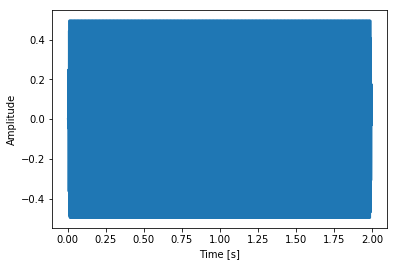
import matplotlib.pyplot as plttime = np.linspace(0., length, data.shape[0])In this case the channels are the same, so just plotting the first one:
plt.plot(time, data[:, 0])
plt.xlabel("Time [s]")
plt.ylabel("Amplitude")
plt.show()
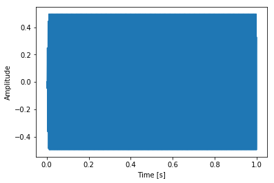
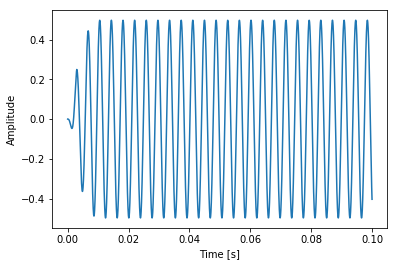
Too much info for this tiny graph! Let’s look at just one second and then zoom in more.
span_length = data.shape[0] // 2span_length44100plt.plot(time[:span_length], data[:span_length, 0])
plt.xlabel("Time [s]")
plt.ylabel("Amplitude")
plt.show()
span_length = data.shape[0] // 20span_length4410plt.plot(time[:span_length], data[:span_length, 0])
plt.xlabel("Time [s]")
plt.ylabel("Amplitude")
plt.show()
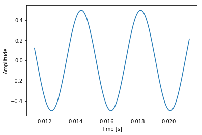
span_length = data.shape[0] // 200span_length441start_sample = 500plt.plot(time[start_sample:start_sample+span_length], data[start_sample:start_sample+span_length, 0])
plt.xlabel("Time [s]")
plt.ylabel("Amplitude")
plt.show()
A simple sine wave!